
Even without studying statistics, it is evident that slides are the face of most online events. Ideally, they should carry critical information, conveying it even to those who put off the sound and flip through the presentation, skipping to the good part. Visuals are best laid down in a person’s memory, especially in the long term.
After three days, only 10-20% of people remember what they’ve read or heard, but a staggering 65% remember what they’ve seen, according to statistics (SHIFT). Our brains are wired to store visual information longer than text or audio.
It takes 6 seconds to read and comprehend 20–25 words on average, but a quarter of a second is enough to process a visual image. Unsurprisingly, presentations with illustrations are 43% more effective than those without, as reported by Prezi.
However, many presenters need help with slide design, with 40-45% experiencing difficulties with the visual component of their presentation. 91% believe they’d feel more confident with a great design (PresentationPanda).
But don’t fret; slide design is not as complicated as it may seem.
Here are some tips from the Pitch Avatar team to make your slides work like a charm.
Styling: consistency is the key, as usual
Start by choosing a basic color scheme for your presentation, with two primary colors and one or two accent colors for lettering and lines. Remember, all colors should have sufficient contrast with each other. If you’re unsure, look up “curated palette” for pre-selected color combinations that work well together.
Next, decide on the main idea behind the illustrations. Tropical landscapes? Office life rendered in paper figures? Two-dimensional cartoon robots? It all depends on the presentation theme and your creativity.
Using corporate colors, designs, and mascots simplifies the task considerably. Canva is an excellent tool for this, as it allows you to input brand colors and logos before designing your presentation. If you don’t have clear branding yet, create it – at least some necessities. Even if you’re a freelancer without a company, develop original stylistic ideas and presentation solutions to make your work easier. Regularly updating your arsenal will ensure you can rely on something other than standard and dull templates for urgent presentations.

Make sure not to cut corners on visual quality.
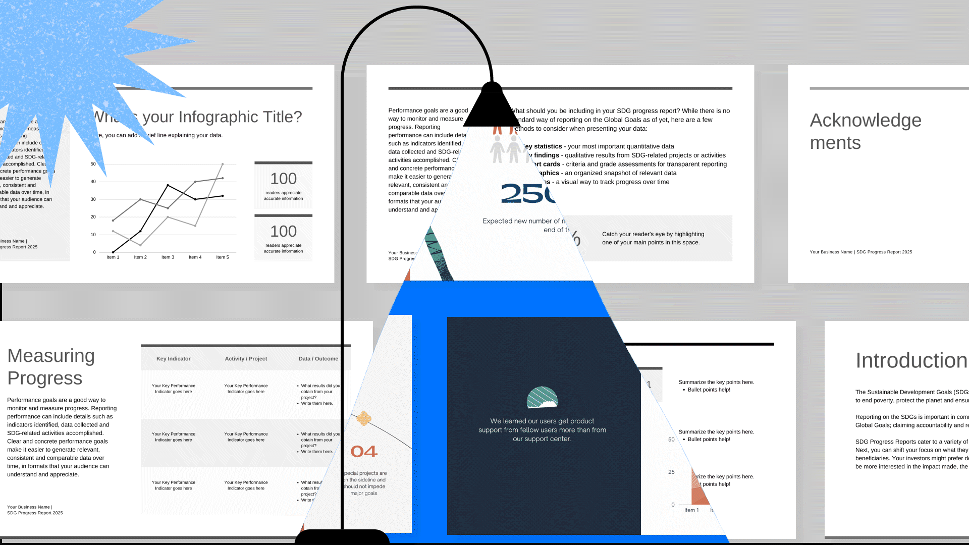
When it comes to creating presentation slides, quality should always be a top priority. Low-resolution images, blurry screenshots, or watermarked images are a surefire way to make your audience lose interest and feel disrespected. If you can’t afford to buy high-quality visuals, try finding free alternatives or creating your own. Remember, though, that simply paying for content doesn’t guarantee success. Sometimes, the most obvious solutions are the worst.
Think of presenting like a sports game. If a coach takes the most obvious route, their team will play along with the opponent. Even if trivial decisions, by some miracle, result in a win, the fans will be disappointed. Similarly, viewers look for an intriguing spectacle when they attend a presentation and want to be surprised and wowed by what they see. Unfortunately, about 80% of regular presentation attendees say that most presentations they watch are boring.
Shift from data to emotion
One cannot underestimate the power of emotional appeal in presentations. While product features and numbers are important, they often fail to capture the viewer’s attention and evoke a response. To illustrate this point, consider the example of adopting a kitten. Rather than inundating potential adopters with details such as weight, color, and behavior, photos or videos that demonstrate the kitten’s adorable appearance and loving demeanor would be much more effective.
The same principle works for presentations. Slides that appeal to human emotions and create a connection with the viewer are more likely to leave a lasting impression. Rather than bombarding the viewers with data and statistics, use visuals that evoke a response, spark interest, and truly resonate with your audience.
Text on a slide? 25% or less
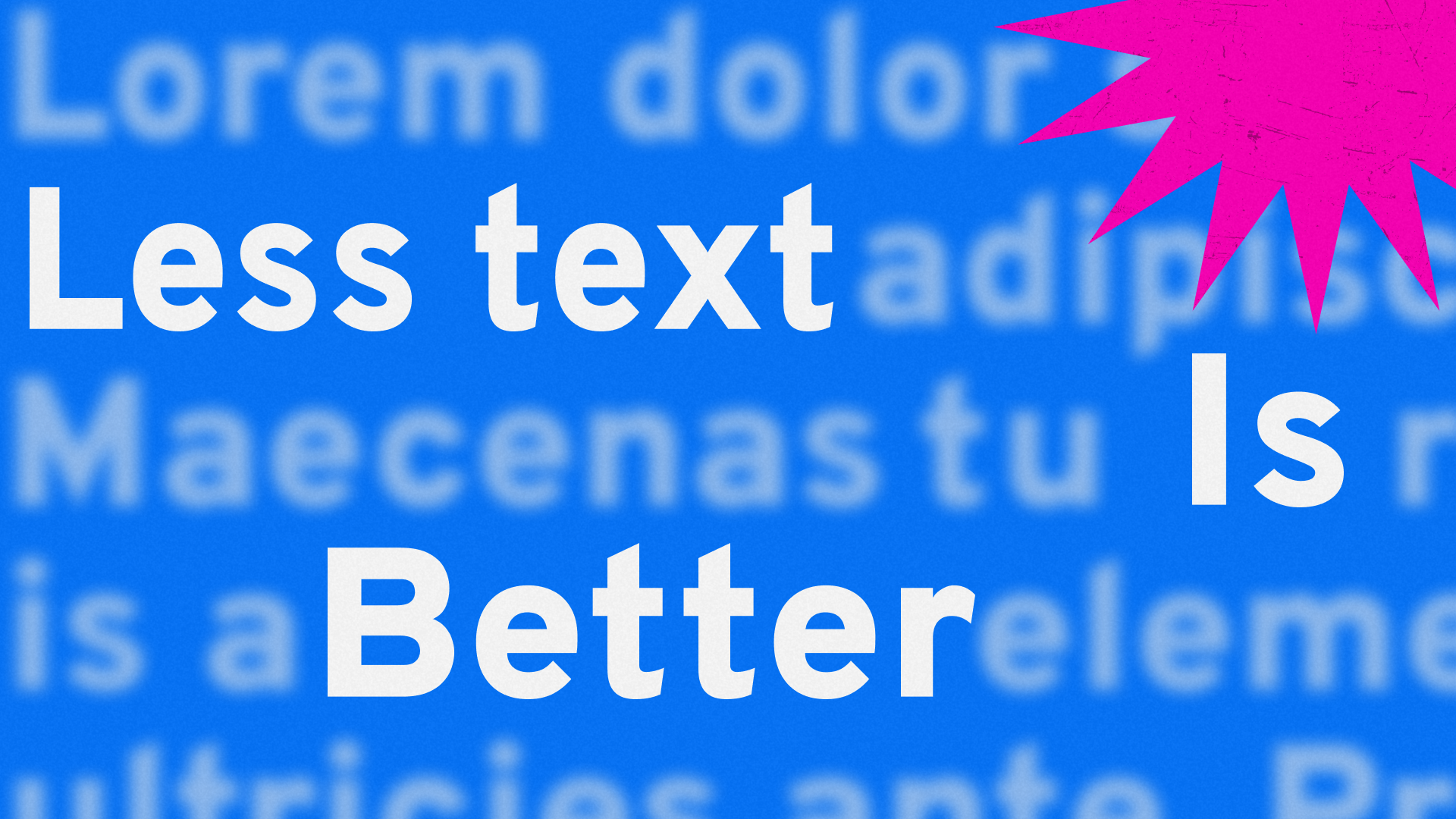
Keeping your audience engaged during presentations is a common struggle, often based on the human inability to read and listen simultaneously. So, one of the huge things to improve is not cramming slides with text. Instead, follow these simple rules:
- No plain text slides. Keep the focus on the main idea by using pictures instead of text-heavy pages.
- Use large, legible fonts. When text is necessary, ensure it is easy to read from a distance.
- Limit text to headings, main ideas, and conclusions. Keep it concise and avoid unnecessary details.
- A text should occupy at most a quarter of the slide area.
Dealing with numbers

Numbers, graphs, and charts are essential in conveying facts and establishing credibility. However, they are often visually dull and fail to engage the audience. Don’t abandon them yet! Add color and icons to create eye-catching visuals that leave a lasting impression.
One slide, one idea

Avoid overloading your slides with too much information. Stick to one idea per slide, as suggested by Guy Kawasaki’s 10/20/30 rule. However, don’t follow it blindly; view it as a guideline, not a dogma. If necessary, add more slides to accommodate your ideas, and don’t be afraid to break the rule for special cases.
Make it move

Animation and GIFs can effectively demonstrate the principles of your products or services in a way that diagrams, drawings, and text descriptions can’t match. Just be sure to keep it short and sweet – aim for 5 to 20 seconds max. You don’t want your animated slide to become an “Inception”-like: a presentation within a presentation that distracts your audience from your message.
Eagle-eyed final editing
Though it might seem like a minor detail, inaccuracies, anachronisms, and mistakes can make you appear unprofessional and cost you, customers. Take the time to double-check your illustrations for consistency with your content. For instance, if you’re giving a tour of England, make sure your slides show images of English landmarks, not German castles! And if you’re promoting a remote work product, avoid using photos taken in an office setting.
Keeping all elements of your slides related will make a better impression on your audience and ensure that your message is received loud and clear.
Don’t forget interactivity
Static slides have been the go-to for most presentations, but incorporating interactive slides can take your presentation to the next level. Interactive slides allow the viewer to engage with the content, such as rotating a product, zooming in and out, changing colors, and more.
Interactive slides also offer an excellent solution for game slides that allow blitz surveys, tests, and contests during the presentation. This level of involvement can increase lead generation and sales, and no wonder, tools allowing fully interactive presentations are becoming increasingly popular.
Summary
Creating effective slides for presentations involves using clear visuals, animation, or interactivity, and it can improve lead generation and sales. When designing slides, don’t overload them with unreadable clusters of text. Ensure that all elements relate to each other and check for inaccuracies, anachronisms, and mistakes that could detract from your presentation’s professionalism.
Remember the principle “show, not tell,” trying to convey information engagingly and memorably. It is especially important if you’re trying to turn your presentation into a never-ending live broadcast with a permanent feedback system using Pitch Avatar.
Good luck to everyone, successful presentations and high revenues!